 Soku AI
Here is the thing almost every Instagram size cheat sheet gets wrong in 2026, and it is not a pixel dimension. It is that the feed and the profile grid now crop your post differently, so there is no single "correct" Instagram post size — there is an overlap you have to design inside.
Upload the recommended 1080 × 1350 and your post is 4:5 in the feed. The same post in your profile grid is previewed at 3:4, which is a taller ratio, so Instagram trims the sides. A caption you centred perfectly for the feed can lose its edges on your own profile page.
That single interaction explains most "why is my text cut off" questions, and it is why this guide is organised around crops rather than a table of numbers.
This page covers organic posts — feed, carousel, profile, Stories and Reels as they appear to followers. If you are producing paid creative, the placement rules and margin requirements are different and stricter; that is covered in our Facebook and Instagram ad sizes and safe zones guide.
The short answer
Upload 1080 × 1350 (4:5) for almost every feed post. It is the tallest ratio the feed accepts, so it claims the most vertical screen space, and everything else is a downgrade in reach per scroll.
Then keep anything that must be readable — faces, logos, text, prices — inside the 3:4 centre column, because that is what your profile grid shows.
Every organic Instagram format in 2026
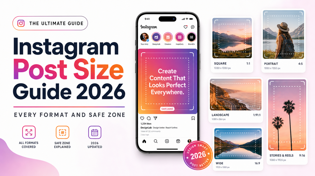
| Format | Upload size | Aspect ratio | Notes |
|---|---|---|---|
| Feed — portrait (recommended) | 1080 × 1350 | 4:5 | Maximum feed real estate |
| Feed — square | 1080 × 1080 | 1:1 | Safe, but gives up ~25% of the vertical space of 4:5 |
| Feed — landscape | 1080 × 566 | 1.91:1 | Smallest footprint in feed; use only when the image is genuinely wide |
| Carousel | 1080 × 1350 | 4:5 | Ratio is set by the first slide; all others are cropped to match |
| Stories | 1080 × 1920 | 9:16 | Full screen |
| Reels | 1080 × 1920 | 9:16 | Cover and grid crop separately — see below |
| Profile photo | 320 × 320 | 1:1 | Displayed as a circle, so corners are always lost |
| Profile grid preview | — | 3:4 | Not an upload size; a crop applied to what you posted |
Two of those rows are not upload sizes at all, and they are the two that cause the problems.
The crop that catches everyone: 4:5 feed vs 3:4 grid
Instagram moved the profile grid from square previews to 3:4 in 2025. The feed still accepts up to 4:5. Those are different ratios, and Instagram resolves the difference by cropping.
Work it through on a standard 1080 × 1350 upload:
- In the feed it displays whole: 1080 wide, 1350 tall.
- In the grid, the cell is 3:4. At 1350 tall, a 3:4 cell is only 1012 pixels wide.
- So the grid trims roughly 68 pixels of width — about 34 pixels from each side, a little over 6% of the image.
Six percent sounds trivial. It is not, because the things people put near the horizontal edges are exactly the things that must not be cut: the end of a headline, a logo lockup in a corner, the left and right thirds of a three-up product shot.
The rule that follows: design at 1080 × 1350, and keep every critical element inside the centre 1012 pixels. Treat the outer ~34 pixels on each side as bleed — visible in the feed, expendable in the grid.
Where text actually survives
Beyond the grid crop, three parts of a feed post are covered by interface elements or truncated by design.
The bottom of the frame. In the feed, the username, caption preview and action row sit below the image, but on some surfaces — Explore, reshares to Stories — overlays encroach on the lower portion. Keep the bottom ~250 pixels free of essential text.
The top of the frame in reshares. When someone reshares your post to their Story, it is centred on a 9:16 canvas with their own sticker furniture around it. Anything in the top and bottom bands is likely to be obscured or competed with.
The caption itself. Instagram truncates captions after roughly 125 characters with a "more" link. The first sentence is the only part reliably read, which is a copy constraint rather than a pixel one, and it matters more than any dimension on this page.
A practical composition default: put the message in the middle 60% vertically and the middle 90% horizontally, and let everything outside that be atmosphere.
Carousels: the first slide sets the rules
A carousel takes its aspect ratio from the first slide and applies it to every subsequent slide. Mix a 4:5 first slide with 1:1 images afterwards and the later images are cropped to 4:5 — usually badly, because they were composed for a square.
Two consequences worth building into your process:
- Export the entire carousel at one ratio, ideally 1080 × 1350.
- Design the first slide last. It determines the crop for everything else and it is the only slide guaranteed to be seen, so it should be chosen once the rest of the sequence exists.
Carousels can hold up to 20 items in 2026, but the drop-off after the third card is steep. Front-load.
Reels and the three-way crop
Reels are the most-cropped surface on the platform, because a single 1080 × 1920 upload gets displayed three different ways:
- Full screen in the Reels tab — the whole 9:16 frame, minus the right-hand action rail and the bottom caption band.
- As a cover in your profile grid — cropped to 3:4, which cuts a large amount from top and bottom.
- As a thumbnail in search and Explore — a smaller, tighter crop again.
The practical move is to choose the cover frame deliberately rather than letting Instagram pick, and to compose the cover so it reads inside the 3:4 grid crop. A Reel cover with a headline near the top of the 9:16 frame simply disappears from your profile.
Keep interactive and text elements clear of the right edge — the like, comment, share and audio controls sit there — and clear of the bottom ~15%, where the caption and audio attribution render.
A file-preparation checklist
- Export JPEG for photography, PNG for graphics with flat colour and text. Instagram re-compresses either way; starting cleaner ends cleaner.
- Upload at 1080 pixels wide. Larger uploads are downsampled, and the downsampling is often less kind than your own export would be.
- Use sRGB, not Adobe RGB or P3. Wide-gamut files are converted on upload and the shift is most visible in saturated brand colours.
- Keep video under the platform's per-format limits and use H.264 with AAC audio; exotic codecs get re-encoded harder.
- Check the render on a phone, in the grid, and in the feed before deciding it works. The grid crop is invisible in every design tool.
Why this keeps changing
Instagram has adjusted feed ratios, grid previews and Reels crops repeatedly, and each change silently re-crops the work already published. The 2025 move from square grid previews to 3:4 retroactively re-cropped every post on every profile on the platform. Nobody got a notification.
That is the actual operating problem with creative specs. They are not hard to follow; they are hard to keep following across dozens of assets and repeated platform changes. Teams running real volume solve it by designing to safe zones rather than to exact frames, so a ratio change trims bleed rather than content.
That is also where an agent earns its place. Soku generates and resizes ad creative across placements from a single source composition, keeping the critical elements inside the safe zone for each surface instead of exporting one file and hoping the crop is kind. For the paid-media version of these constraints — where a bad crop costs money rather than reach — the Facebook and Instagram ad sizes and safe zones guide is the companion piece.
Frequently asked questions
What is the best Instagram post size in 2026?
1080 × 1350 pixels (4:5 portrait). It is the tallest ratio the feed accepts, so it occupies the most screen space per scroll. Keep critical content within the centre 1012 pixels of width so it also survives the 3:4 profile grid crop.
Why is my Instagram post cropped on my profile?
Because the profile grid previews at 3:4 while the feed displays up to 4:5. A 1080 × 1350 post is trimmed by roughly 34 pixels on each side in the grid. Design inside the centre 1012 pixels to avoid it.
What are Instagram's supported feed aspect ratios?
Three: 4:5 portrait (1080 × 1350), 1:1 square (1080 × 1080), and 1.91:1 landscape (1080 × 566). Anything outside that range is cropped or letterboxed on upload.
What size should Instagram Stories and Reels be?
1080 × 1920 pixels, 9:16. Keep text and key elements away from the right edge, where the action rail sits, and out of the bottom ~15%, where captions and audio attribution render.
Does Instagram reduce image quality on upload?
Yes — uploads are re-compressed and anything wider than 1080 pixels is downsampled. Export at exactly 1080 pixels wide in sRGB to keep control of the result rather than leaving the downsample to Instagram.
How many images can an Instagram carousel hold?
Up to 20 in 2026. All slides are cropped to the aspect ratio of the first slide, so export the whole set at one ratio — and expect a steep engagement drop after the third card.