 Soku AI
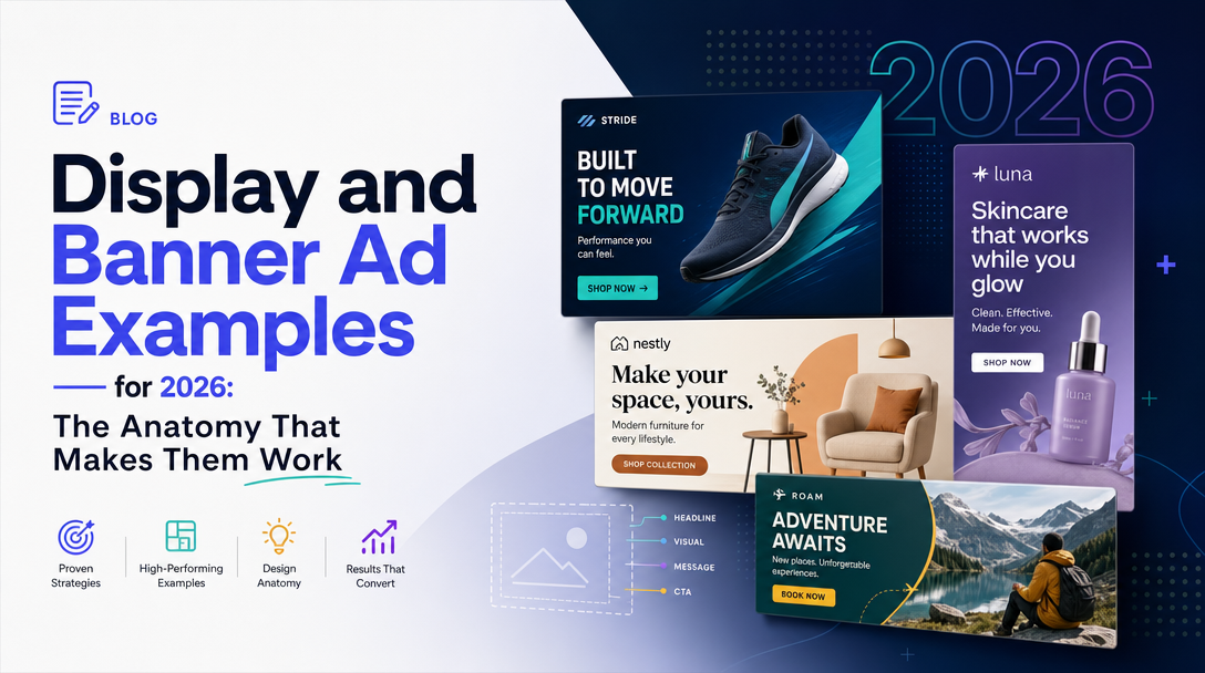
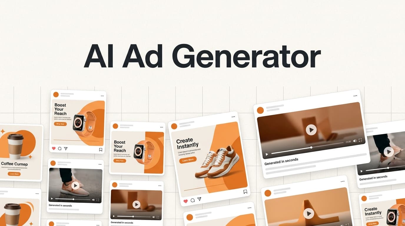
Search "display ad examples" and you get galleries. Twenty-four banners, arranged by objective, each with a caption explaining that it uses "bold visuals" and a "clear value proposition". They are pleasant to scroll and almost useless to work from, because they show you the output without ever naming the constraint that produced it.
Here is the constraint. A Google Display image ad may not exceed 150KB. It has to work at 728×90, where you have a strip nine times wider than it is tall, and at 320×50, where the whole ad is smaller than a business card. The same offer, the same brand, the same promise — rendered into shapes that have nothing in common except that a human will spend roughly a second deciding whether to ignore them.
Every good display ad you have ever seen is a solution to that problem. So this page is organised around the problem rather than the gallery: the complete verified format surface, the six structural slots that every effective banner fills, what the copy patterns actually are, and where display genuinely does and does not pay.
The complete Google Display size table (most guides show you five)
Nearly every "banner ad sizes" article names the same five formats — 300×250, 336×280, 728×90, 300×600, 320×50 — and stops. Those five are the right starting set, and we will come back to why. But the actual supported surface is considerably wider, and knowing the rest matters the moment you buy inventory outside the US or run a publisher direct deal.
Read from Google's own image-ad specification on 2026-08-14:
| Category | Supported sizes |
|---|---|
| Square and rectangle | 200×200, 240×400, 250×250, 250×360, 300×250, 336×280, 580×400 |
| Skyscraper | 120×600, 160×600, 300×600, 300×1050 |
| Leaderboard | 468×60, 728×90, 930×180, 970×90, 970×250, 980×120 |
| Mobile | 300×50, 320×50, 320×100 |
Accepted formats: GIF, JPG, PNG. Maximum file size: 150KB. That ceiling applies per ad, and it is the single most under-discussed number in display advertising.
There are also region-specific sizes that exist nowhere in the standard tables: Poland accepts 750×100, 750×200 and 750×300; Sweden adds 980×120 and 250×360; Denmark adds 930×180; Norway adds 580×400. If you are running European display and wondering why a publisher's spec sheet lists a dimension your creative team has never produced, this is why.
The five that actually earn their build time
Producing all nineteen sizes is a real cost, and for most advertisers it is not worth paying. Build these five first:
- 300×250 (medium rectangle) — the workhorse. It is accepted on effectively every site, renders on desktop and mobile, and sits naturally in sidebars, mid-article and end-of-article slots. If you build exactly one size, build this one.
- 728×90 (leaderboard) — desktop above-the-fold inventory.
- 320×50 (mobile leaderboard) — the mobile equivalent, and non-negotiable given where browsing actually happens.
- 300×600 (half page) — large, prominent, and disproportionately strong for brand work because it occupies real estate rather than competing for a glance.
- 336×280 (large rectangle) — the 300×250's larger sibling, worth building because the incremental design cost over 300×250 is close to zero.
320×100 deserves a sixth slot. It is the large mobile banner, and it consistently outperforms 320×50 for the simple reason that doubling the height turns an impossible layout into a merely difficult one. If your mobile display is underperforming and you have only shipped 320×50, this is the cheapest experiment available to you.
The 150KB problem, and why it shapes every example you admire
Here is the thing the galleries never mention. 150KB is generous for a flat two-colour layout with a logo and eight words. It is tight for a lifestyle photograph. It is genuinely hard for an animated GIF.
This constraint is why the display ads that work look the way they do. Flat colour blocks, heavy typography, a single cut-out product on a solid background, high-contrast brand palettes — these are not merely a design fashion. They are what compresses well. The category's visual language was shaped by a file-size ceiling as much as by any theory of attention.
Three practical consequences:
- A photographic hero costs you the rest of the ad. If the image is going to eat 120KB, your headline has to be live text rendered in the file rather than a second layered asset, and your animation budget is zero. Decide this before design, not after.
- Animation is a budget, not a feature. Every frame of a GIF is bytes. A four-frame reveal in flat colour is affordable; a four-frame reveal over a photograph is not. Most effective animated banners animate type and shape, not imagery, and that is the reason.
- Export discipline is a performance lever. The same design exported carelessly and exported well can differ by 60KB, which is the difference between shipping a 300×600 with a real product photo and shipping a compromise.
The six slots every effective display ad fills
Strip the styling from any display ad that works and the same skeleton is underneath. Not every ad uses all six, but the strong ones make a deliberate decision about each.
1. The identifier. Who is talking. Usually the logo, occasionally a product silhouette distinctive enough to do the job alone. Its purpose is not brand-building — it is to let a reader who already knows you recognise you in under a second, because those are the readers who convert.
2. The subject. One product, one service, one idea. The single most common failure in display is trying to sell a category. "Our platform does eight things" is unreadable at 320×50 and unpersuasive at 300×600.
3. The promise. What the reader gets. This is the headline, and it carries most of the ad's weight. It must be legible at your smallest planned size, which in practice caps it at roughly five to seven words.
4. The number. A price, a discount, a benchmark, a quantity, a time. Specificity is the cheapest credibility available to a banner, and it is what separates "Save on running shoes" from "Running shoes from $59". A number also gives the eye something to land on, which matters more than it sounds when the reader is not looking for you.
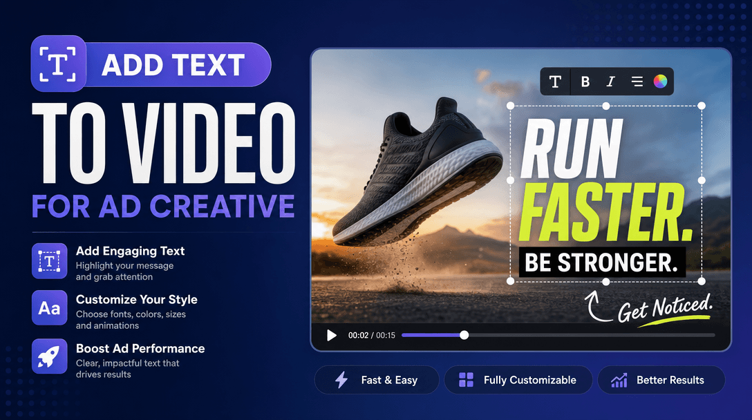
5. The action. A button, styled as a button. Not a line of text that happens to be clickable — a shape with a fill and a border radius, because two decades of interface convention have trained people that this is the thing you press. The whole ad should be clickable; the button is there to say so.
6. The contrast. Enough separation from the host page that the ad reads as a distinct object. This is the slot most often lost, because ads are designed on a clean artboard and deployed onto a cluttered content page.
How the slots change with shape
The skeleton is constant; the arrangement is not.
- 300×250 and 336×280 hold all six comfortably in a stacked layout: identifier top, subject as image, promise, number, button.
- 728×90 and 970×90 force a horizontal read. Identifier left, promise centre, button right. The subject usually has to become a small cut-out or disappear entirely, and the promise has to shrink to about four words.
- 300×600 and 300×1050 are the only formats with room to argue. You can carry a promise, a supporting line, three bullets and a button — which is why they are the natural home for B2B and considered purchases.
- 320×50 holds three slots at most. In practice: identifier, promise, button. The number usually has to go inside the promise ("From $59") because there is no room for a second line.
If you take one thing from this section: do not design at 300×250 and scale down. Design the 320×50 first, because it is the hardest, and let its brutal edit tell you what your actual promise is. Everything larger is then an expansion of something you have already proven can be said briefly.
Display ad examples by objective — what the patterns actually are
Rather than a gallery, here is what each objective's effective ads have structurally in common, and the copy formula underneath.
Brand awareness
Pattern: heavy typography, minimal product, brand colour doing most of the work, one line of claim. The identifier and the contrast slots carry the ad; the number slot is usually empty, deliberately.
Copy formula: [Category] without [the category's known annoyance].
Awareness display is the format most often bought and least often measured honestly. Its job is to make a branded search cheaper and more likely later, which means the metric that matters is branded search volume and view-through behaviour, not the click-through rate of the banner itself.
Ecommerce and product sales
Pattern: one product cut out on a flat background, price visible, shipping or returns promise as a supporting line. This is the objective where the number slot is doing the heaviest lifting.
Copy formula: [Specific product], [price]. [Risk-reversal]. — "Merino crew, $59. Free returns."
The strongest ecommerce banners name the actual product rather than the category. "Running shoes" competes with everyone; "Trail shoe, 240g, $129" competes with almost no one.
Retargeting
Pattern: the specific item the reader looked at, or an unambiguous reference to it, plus a reason to come back now.
Retargeting splits into three genuinely different audiences that deserve genuinely different creative, and collapsing them is the most common waste in the channel:
- Product viewers — show the product, add the missing information that stopped them (size availability, delivery date, a review count).
- Cart abandoners — they have already decided; remove friction rather than re-selling. Shipping threshold, payment options, stock scarcity if it is true.
- Past customers — never re-sell the thing they bought. Show the complement, the refill, or the upgrade.
Lead generation and B2B
Pattern: the asset is the subject. A benchmark report, a calculator, a template, an audit. The promise slot describes what the reader learns, not what your company does.
Copy formula: [Specific artefact] for [specific role]. — "2026 paid media benchmarks, for agency leads."
B2B display is where 300×600 earns its keep, because the purchase is considered and you need room to establish that the artefact is worth an email address.
Call-to-action text: what to use instead of "Learn More"
"Learn More" is the default because it is safe, and it is safe because it promises nothing. That is precisely the problem — it gives the reader no information about what happens after the click, so it converts the already-convinced and nobody else.
Better CTAs describe the destination or the artefact:
| Instead of | Use | Why |
|---|---|---|
| Learn More | See the price | Removes the reader's largest unanswered question |
| Get Started | Start free, no card | Names the friction that stops signups |
| Download | Get the 2026 benchmarks | Describes the artefact, not the file transfer |
| Shop Now | Shop the sale — ends Sunday | Adds the only thing that creates urgency honestly |
| Sign Up | Book a 20-min walkthrough | Sets the time cost, which is what people are protecting |
The rule underneath: a CTA should reduce uncertainty, not manufacture enthusiasm. Readers do not click because you sounded excited. They click because the next step became legible.
What display advertising actually does — the honest numbers
Display is bought on a misunderstanding roughly as often as it is bought well, and the misunderstanding is almost always about click-through rate.
Display CTR sits well under 1% across most industries. Search CTR is multiples higher. Advertisers see that gap and conclude display is broken. It is not broken; it is a different purchase. Display CPC runs a fraction of search CPC precisely because the intent is a fraction as strong. You are not buying people who are looking for you. You are buying visibility among people who are not.
Which means the metrics that matter are different:
- Viewability — the proportion of your impressions that were actually onscreen (the standard bar is 50% of pixels for at least one second). An impression that was never seen cannot have worked, and viewability varies enormously by placement. Check it before you conclude the creative failed.
- View-through behaviour — display's real contribution is often people who saw and did not click, then arrived later through search or direct. Last-click attribution structurally cannot see this, which is why display looks worse in a last-click report than it is. It is also why display looks better in some vendor dashboards than it is, because generous view-through windows credit display for conversions it merely witnessed. Both errors are real; the correction is an incrementality test, not a different attribution model.
- Branded search lift — for awareness display, the cleanest available signal is whether branded search volume moves during and after a flight.
We wrote about the wider version of this problem in multi-touch attribution models compared, including how much conversion volume each model honestly needs before its output means anything. Display is the channel where getting this wrong costs the most, in both directions.
A production checklist
Before a display set goes live:
- Smallest size first. Design 320×50, then expand. If the promise does not survive there, it is not a promise, it is a paragraph.
- Every size under 150KB, checked after export rather than assumed.
- The button looks like a button at every size.
- Legibility test at arm's length, on a phone, at actual size — not zoomed on a monitor.
- Contrast against a real page, not the artboard. Drop the ad onto a screenshot of a site you actually buy.
- The number is specific and true. "Up to 50% off" is weaker than "$59" and much weaker than both if it is only true of one discontinued item.
- Retargeting audiences are split into viewers, abandoners and customers, with different creative for each.
- One variable per test. Changing the image, headline and CTA together tells you a set won, not why.
How to test display creative in six weeks
Display's low CTR makes creative testing statistically slower than most teams expect, and the usual mistake is calling a winner at day four on eleven clicks.
- Weeks 1–2: ship three genuinely distinct concepts — not three colourways — at your top three sizes. Distinct means a different promise, not a different button.
- Weeks 3–4: kill the clear loser, split the surviving two into variants that change one slot each (the number, or the CTA).
- Weeks 5–6: hold the winner and test it against a new distinct concept. Never let your champion go untested, and never test it against a variant of itself forever — variant testing converges on a local maximum and stays there.
Be honest about volume. If your display budget produces forty clicks a week, you cannot run this schedule, and pretending otherwise means shipping decisions made from noise. At that volume, pick the creative you can defend on principle, run it long enough to matter, and spend the energy on placement quality instead.
Where display sits in an AI-assisted creative workflow
The economics of display have always been strained by production cost. Six sizes multiplied by three concepts multiplied by three retargeting audiences is fifty-four assets, and that is why most advertisers ship one concept at two sizes and conclude the channel does not work.
This is the part of the problem that has genuinely changed. Generating and resizing variants across the format matrix is now cheap, which shifts the binding constraint from production to judgement — deciding which promise to test, and reading the result honestly once volume allows. Soku generates ad creative and deploys and tests it across Meta, Google and TikTok, reading performance data back to decide what to run next; we build it, so treat that as disclosure rather than a neutral recommendation.
The general point stands regardless of tooling: if variant production is no longer your bottleneck, the honest question becomes whether you have enough traffic to learn from the variants you can now afford to make. For a lot of display budgets, the answer is no, and the right move is fewer, better-targeted placements rather than more creative.
Frequently asked questions
What is the best display ad size?
300×250, the medium rectangle. It carries the widest inventory, renders on both desktop and mobile, and fits the most placement types. Build it first, then 728×90, 320×50, 300×600 and 336×280.
What is the maximum file size for a Google display ad?
150KB, for GIF, JPG and PNG. This applies per ad and is the constraint that shapes most display design decisions.
Why is my display CTR under 1%?
Because that is normal. Display CTR sits well below 1% across most industries, since you are reaching people who were not looking for you. Judge display on viewability, view-through behaviour and branded search lift rather than on click-through rate alone.
How many banner sizes do I actually need?
Five covers most inventory: 300×250, 336×280, 728×90, 300×600 and 320×50. Add 320×100 if mobile matters, which it usually does — it routinely outperforms 320×50 because the extra height makes a real layout possible.
Should I use responsive display ads or fixed-size banners?
Responsive ads maximise reach with minimal production, and are the right default when you cannot staff a full size matrix. Fixed-size banners give you control over the layout at every shape, which matters when brand presentation is a requirement rather than a preference. Most mature accounts run both and compare.
Do animated banners outperform static ones?
Sometimes, but the 150KB ceiling means animation competes directly with image quality. Animating type and shape is affordable; animating photography usually is not. Test it as a variable rather than adopting it as a rule.
Where to go next
- Facebook and Instagram ad sizes and safe zones — the paid social equivalent of this format problem, with stricter margin rules.
- Multi-touch attribution models compared — how to measure a channel whose main contribution is not the click.
- Generative AI in display advertising — what changes when the format matrix stops being a production cost.
Sources
Google Display image ad dimensions, accepted file formats, maximum file size and region-specific sizes read from Google Ads Help — image ad specifications on 2026-08-14. Format performance rankings, the six-slot framework, copy formulas, the CTA table, the testing schedule and all recommendations are Soku's own analysis. Display CTR and CPC characterisations are directional industry ranges rather than measured figures from a specific account — verify against your own data before budgeting.