 Soku AI
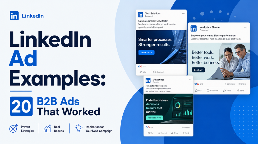
A note on evidence before the list, because "20 LinkedIn ads that worked" is a claim most articles make and almost none can support.
Advertisers do not publish their LinkedIn results. LinkedIn publishes a small number of case studies with real figures, and its Ad Library exposes live creative — with impression ranges and targeting parameters for ads served in the EU, and much less for anywhere else. Everything else circulating as a "high-performing LinkedIn ad" is someone's screenshot with an invented metric attached.
So this page is explicit about which is which. Where a result is published, it is quoted and linked. Where it is not, the example is presented as a pattern — a structure that recurs across the Ad Library and holds up against how the format is actually priced and delivered. No invented CTRs.
The genuinely useful part is at the end: how to pull up any competitor's real, current LinkedIn ads in about two minutes, so you are working from live evidence rather than from a listicle.
First: the formats, because format decides more than copy
LinkedIn creative fails more often from format choice than from writing. The main formats in 2026 and what each is actually good for:
| Format | Spec | The job it does |
|---|---|---|
| Single image | 1200×627 (1.91:1), 1200×1200 (1:1), or 720×900 (4:5); ≤5 MB | Everyday workhorse; 1:1 is the sane default |
| Carousel | 1080×1080, 2–10 cards | Sequential argument, or several proof points |
| Video | 4:5 to 16:9; captions essential | Demo, founder message, customer story |
| Document | PDF/DOCX/PPTX, first page is the creative | In-feed reading; strong for gated content |
| Thought leader | Promotes a real person's post | Borrowed credibility from a face |
| Conversation | Interactive, branching; optional 300×250 banner | Qualification via choices |
| Message | Single sponsored inbox message | Direct, expensive, easy to get wrong |
| Event | Promotes a LinkedIn event | Registration |
| Text / Spotlight / Follower | Right-rail, desktop | Cheap retargeting and follower growth |
Two rules hold across all of them. Design for a 1:1 or 4:5 frame — LinkedIn is majority mobile and landscape gives up half the vertical space. And assume the sound is off, so any video without burned-in captions is a video that does not communicate.
The 20 examples
Single image (1–5)
1. The number-first statement. A single large figure — "73% of pipeline never gets followed up" — on flat brand colour, with the claim's source in small type beneath. Works because the feed rewards one legible idea and the source pre-empts the "says who" reflex. Fails when the number is generic or unattributed.
2. The named-objection ad. Headline states the objection out loud: "Too small for an enterprise data warehouse?" Effective because it lets self-qualifying readers opt in, and it inverts the usual dynamic of the ad pretending the objection does not exist.
3. The competitor-switch ad. "Moved from [category leader] to us in a weekend." High-intent, and its performance depends almost entirely on whether the switching claim is specific — a named timeline beats an adjective.
4. The org-chart ad. Speaks to one role by name: "For RevOps leads who inherited someone else's Salesforce." Narrow by design. LinkedIn's targeting is job-title-native, so the creative matching the targeting is the whole point of advertising here rather than elsewhere.
5. The screenshot-of-the-product ad. A real UI frame, cropped tight to one screen, with a one-line caption. Underused because it feels unglamorous, and it works for the same reason — it answers "what is this actually" before the click rather than after.
Carousel (6–9)
6. The sequential teardown. Card 1 poses a problem, cards 2–4 each remove one cause, card 5 is the offer. Carousels earn their cost only when the cards are dependent; a carousel of five unrelated benefits performs like a worse single image.
7. The before/after workflow. Two states of the same process, split across cards. Concrete, easy to skim, and hard to fake — which is why it tends to be honest.
8. The mini case study. Card 1 names the customer and the outcome, cards 2–4 give the method, card 5 offers the full story. Corporate Visions is the widely cited example of a carousel-led B2B programme, reported by HubSpot as delivering a 116% year-over-year increase in qualified leads.
9. The checklist carousel. One item per card, each self-contained. The weakest carousel structure but the most reliable, because it degrades gracefully when someone stops swiping.
Video (10–12)
10. The 15-second founder direct-to-camera. No production values, captions burned in, one claim. Consistently outperforms polished brand film in B2B feeds because it reads as a person rather than a campaign.
11. The silent product walkthrough. Screen recording, large on-screen labels, no voiceover at all. Removes the sound-off problem by design instead of mitigating it.
12. The customer-in-their-own-words clip. A single unscripted sentence from a real user, captioned. The credibility is in the imperfection; a scripted version of the same clip performs worse.
Document ads (13–15)
13. The one-page benchmark. A genuinely useful data page as the document itself, readable in-feed without downloading. Document ads are read in the feed, so a document whose first page is a title card wastes the format entirely.
14. The template. A framework, checklist or calculator someone can use immediately. Highest-intent lead magnet type on LinkedIn, because the value is legible before the form.
15. The teardown deck. Ten pages analysing something specific and real. Long by feed standards, which is why it filters hard for genuine interest.
Thought leader ads (16–17)
16. The employee post, promoted. A real post from a real employee with a real face, put behind spend. It borrows the trust people extend to individuals and withhold from logos, and it is the single biggest format shift in B2B LinkedIn advertising in recent years.
17. The contrarian take. A named person arguing against their own category's orthodoxy. Generates comment volume, which is itself distribution — with the corresponding risk that the comments become the ad.
Conversation and message (18–19)
18. The two-branch qualifier. A conversation ad opening with a genuine either/or that routes to different destinations. This is the one example on the page with a published, first-party result: Hired, working with B2Linked, replaced one-directional Message Ads with Conversation Ads using simple yes-or-no questions to filter candidates by role, and reported that "the clickthrough rate was almost five times higher than what we'd seen previously."
19. The short message ad. Three sentences, one ask, no attachment. Message ads are priced per send and are the easiest format to waste money on; length correlates inversely with response in almost every account we have seen.
Event and retargeting (20)
20. The event ad plus spotlight retarget. An event ad drives registration; a cheap Spotlight ad retargets everyone who engaged but did not register. The pairing matters more than either creative — the event ad alone leaves most of the audience unconverted.
How to see real LinkedIn ads yourself
This is the part that beats any list, including this one.
LinkedIn's Ad Library is public and requires no account. Search a company and you see its live and recent ads. The important asymmetry: for ads served in the EU, LinkedIn is required to disclose impression ranges and targeting parameters — country, age, gender, and whether targeting was interest- or profile-based. For a US-only campaign you get creative and little else.
So the workflow is:
- Open the Ad Library and search the competitor.
- Sort by date to separate always-on creative from campaign bursts.
- Look for the ads that have been running longest — in a rational account, duration is the closest public proxy for performance.
- For any ad with EU delivery, open the detail view for impressions and targeting.
- Note which formats dominate their spend, not just which images they used.
Point four is the one people miss. A creative running for six months is a creative that survived someone's optimisation decisions repeatedly. That is a stronger signal than any metric in a listicle.
We covered the mechanics, the retention rules and the duplication trap in depth in our LinkedIn Ads Library guide.
What actually separates the ones that work
Across every format above, three things recur.
The targeting is in the creative. LinkedIn's advantage is that it knows job titles, company sizes and industries. An ad that could run on any platform is wasting the premium you paid for LinkedIn's CPMs, which are among the highest in paid social. If the ad does not name who it is for, you bought expensive impressions to say something generic.
One idea per ad. The feed grants roughly one legible thought. Ads that carry three benefits communicate none.
Faces beat logos. Thought leader ads, founder video and customer clips consistently outperform brand-voice creative, and this is the clearest directional pattern in the format data.
The operational problem is that these principles imply volume. One idea per ad, matched to specific job titles, across several formats, means dozens of variants per campaign — and refreshed as they fatigue. That is a production problem more than a creative one, and it is where most B2B programmes stall at three ads and stay there.
That production layer is what Soku automates: generating and resizing variants per format and per audience from one source concept, so the "one idea per ad, matched to the segment" rule survives contact with a real content calendar.
Where to go next
- LinkedIn Ads Library — how to research competitor ads properly, including the EU disclosure asymmetry
- Free PPC report template — reporting structure for multi-channel paid social
Frequently asked questions
What are the best-performing LinkedIn ad formats for B2B?
Thought leader ads, document ads and conversation ads consistently outperform standard single-image creative for B2B, because each solves a specific LinkedIn problem: trust in a person rather than a brand, in-feed reading rather than a gated download, and self-qualification rather than a single call to action. Single image remains the workhorse for volume.
Where can I see real LinkedIn ad examples?
LinkedIn's Ad Library is public and free, with no account required. It shows live and recent ads for any company, and for ads delivered in the EU it also discloses impression ranges and targeting parameters. It is a far better source than curated listicles because it is current and unfiltered.
What size should a LinkedIn ad image be?
Single image ads support 1200×627 (1.91:1 landscape), 1200×1200 (1:1 square) and 720×900 (4:5 vertical), up to 5 MB. Use 1:1 or 4:5 by default — LinkedIn traffic is majority mobile and landscape gives up substantial vertical space in the feed.
Do LinkedIn ads need captions on video?
Yes. LinkedIn video autoplays muted, so any message carried only in audio is lost for most impressions. Burn captions into the file rather than relying on auto-generated ones.
Why are LinkedIn ads so expensive?
LinkedIn prices against professional targeting data — job title, seniority, company and industry — which is unavailable at that fidelity elsewhere, so CPMs run well above other paid social. That premium is only worth paying if the creative and offer are specific to the segment you targeted; generic creative on LinkedIn is the most expensive way to run a generic ad.
How many LinkedIn ads should I run per campaign?
Enough to cover your distinct audience segments with one idea each, typically four or more per audience, refreshed as they fatigue. Running a single ad per campaign forfeits the format's main advantage, which is matching a specific message to a specifically defined professional audience.