Soku AI

A static ad is the cheapest unit of creative you can test, and in 2026 that makes it more useful, not less. Meta's delivery system now filters "tens of millions of ad candidates" down to "a few thousand" before ranking them (Meta Engineering, Andromeda), and Meta's own advice to advertisers is to feed that system distinct creative across text, image and video. Google's Performance Max won't publish an asset group without landscape and square images. TikTok built Carousel Ads specifically for advertisers who don't have video.
Most pages ranking for "static ads" stop at a definition and a gallery of other brands' work. This one covers the definition, when static beats video according to the platforms' own documentation, the formats each platform asks for, ten static ad types, and a testing method. It also includes something the ranking pages don't: six static concepts we generated from one brief for a fictional brand, each annotated with its hook and offer pattern and with the defects the model introduced.
Last verified: 2026-10-20. Every platform claim links to the help page we read that day. If you want finished examples from real brands organized by persuasion mechanism, start with our 40 advertisement examples. This page is the playbook for making and testing your own.
What is a static ad?
A static ad is a paid ad built from one still image: no motion, no sound, no swiping. It typically combines a product or lifestyle image, a short headline on the image, and the platform's own text fields (primary text, headline, call-to-action button) around it.
The platforms don't use the word "static". The same thing goes by different names:
| Platform | What it calls a static ad | Where it serves |
|---|---|---|
| Meta (Facebook, Instagram) | Image ad | Feeds, Stories, Reels and other placements |
| Google Ads | Image assets in Performance Max, Demand Gen and responsive display ads | YouTube, Discover, Gmail, Display Network, Maps (by campaign type) |
| TikTok | Carousel Ads (images in the in-feed slot) | TikTok feed |
| Single image ad | LinkedIn feed |
Two clarifications that matter for testing:
- Static is about the creative, not the targeting. A static ad can still be targeted, retargeted and optimized. What makes it static is that the image itself doesn't change.
- Static is not the opposite of AI-assembled. On Google, you upload static images and the system combines them with your headlines into many ad layouts. On Meta, Advantage+ creative enhancements can adjust how your still image is shown, for example cropping or expanding it to fit more placements. You're supplying static assets; the platform may not serve them as a single fixed ad.
If your creative needs a sequence (several products, steps, or a before-and-after told in frames), that's a carousel. If it needs movement or sound, that's video. Everything else is a static.
When static ads beat video, according to the platforms
No platform publishes a "static beats video by X%" number, and we're not going to invent one. What the platforms do publish is guidance that tells you when a still image is the right tool.
1. When the message fits in one frame
Meta's text overlay guidance says it plainly: "Don't communicate too many messages because ads usually only have one call to action" (Meta Business Help: text overlays and safe zones). A static ad forces that discipline. If the whole pitch is "first bottle $14" or "4.9 stars from people like you", a still image delivers it in the time it takes to scroll past. If the pitch is "watch how it folds flat", you need video.
2. When you need many distinct angles quickly
This is the strongest case for statics in 2026. Meta's engineering team describes Andromeda as the retrieval stage that selects from "tens of millions of ad candidates" down to "a few thousand relevant ad candidates" before ranking (Meta Engineering). In its December 2025 advertiser guidance, as reported by Social Media Today, Meta recommended "creative diversification as a foundational best practice" and a "broad portfolio of assets that take more creative liberty across text, image, and video."
Distinct angles are what that system needs, and a still image is the cheapest way to produce a distinct angle. A new static concept costs a headline and a layout. A new video concept costs a script, a shoot or a generation run, and an edit.
3. When you don't have video, and the platform will fill the gap anyway
TikTok describes Carousel Ads as "an alternative ad format to video if you don't have video creatives available or you want to reuse creative assets from other platforms" (TikTok Ads Manager: About Carousel Ads, last updated September 2026). They're available for Traffic, Web Conversions, App Promotion, Lead Generation, Catalog Product Sales and Brand Auction Reach.
Google goes further. Its Performance Max spec page says that if you don't add a video to an asset group, "one or more videos may be auto-generated from the assets in your asset group" (Google Ads Help: Performance Max specs). So on Google, static-only isn't really static-only: your images become the raw material for video Google makes for you. If you'd rather control that, upload your own videos in all three orientations.
4. When the buyer is already warm
Retargeting, offer announcements, restocks and price drops all suit statics. The viewer already knows the product; the ad's job is to deliver one new fact (the price, the deadline, the review) and a button.
When video wins instead
Video earns its extra production cost when the product needs demonstrating (texture, motion, setup, before-and-after in real time), when a person talking to camera is the persuasion, or when the placement is built for sound and motion. TikTok's in-feed format and Reels are video-first placements; a static there is the exception, not the default. For a structured way to make video variants at volume, see our guide to creating 100+ AI ad variants.
Static ad sizes by platform (the short version)
We maintain full, source-verified tables elsewhere, so this section only gives you what you need to brief a static concept. For every placement, file limit and safe-zone margin on Meta, use our Facebook and Instagram ad sizes and safe zones guide. For organic Instagram posts (and why the profile grid crops differently from the feed), see the Instagram post size guide. For Google Display banner sizes and the 150KB limit, see display ad examples. For LinkedIn formats, see LinkedIn ad examples.
The briefing defaults:
| Platform / campaign | Make these shapes | Notes from the platform |
|---|---|---|
| Meta feeds | 4:5 portrait (1080 x 1350), plus 1:1 | For Instagram Feed ads in 1:1 or 4:5, Meta says to keep the bottom and side edges free of key elements |
| Meta Stories and Reels | 9:16 (1080 x 1920) | Keep top, bottom and sides clear; leave the bottom 40% free if you include disclaimers on Reels ads |
| Google Performance Max | 1.91:1 (1200 x 628) and 1:1 (1200 x 1200) required; 4:5 (960 x 1200) optional | Recommends 4+ landscape, 4+ square, 2+ vertical; up to 20 images per ratio; 5120 KB max |
| Google Demand Gen | 1.91:1 and 1:1 required; 4:5 optional | Recommends 3 of each; up to 20 per ratio |
| TikTok | Carousel images | Images display in order in the feed and people swipe through them |
Sources: Meta text overlays and safe zones, Performance Max specs, Demand Gen specs, TikTok Carousel Ads, all read 2026-10-20.
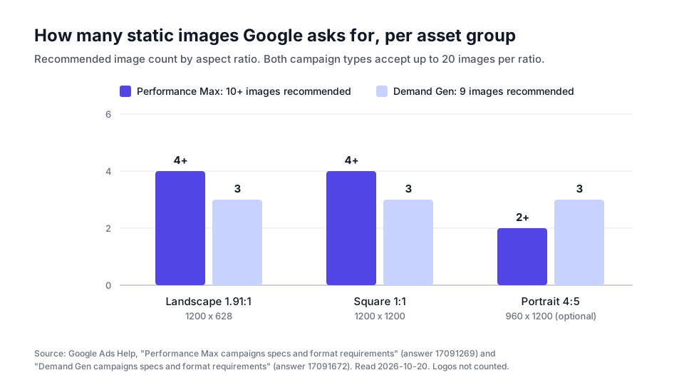
The chart makes one practical point: a single Google asset group wants nine or ten static images before you've tested anything. Google's own spec page notes that 1200 x 628 and 1200 x 1200 are "the most common Google Ads image sizes" and serve across "the majority of Google's network and placements" (Google Ads specs overview). If those images are ten crops of one photo, you've given the system one idea ten times. Ten images across four or five concepts gives it something to choose between.
Before you upload, drop the 9:16 versions into our ad safe zone checker to see what the Reels and Stories interface covers, or put the feed version into the ad mockup generator to check how much of your primary text survives.
10 types of static ads
There's no official taxonomy. These are the ten patterns that show up repeatedly in ad libraries, sorted by the job each one does. The "hook" is what stops the scroll; the "offer" is what the viewer gets for clicking.
| # | Type | Hook | Offer | Best for |
|---|---|---|---|---|
| 1 | Offer-led | The price or deal itself, in the biggest type | Discount, intro price, free shipping, bundle | Warm audiences, launches, sales |
| 2 | Testimonial / review | A customer's words in quote marks, star rating | Social proof, then the product | Skeptical or comparison-stage buyers |
| 3 | Us vs them / comparison | A split frame that makes the difference visible | "Switch and get X" | Buyers already using an alternative |
| 4 | Feature callout | The product, labelled with 3 to 5 benefits | Clarity: what you get | Products with tangible specs |
| 5 | UGC-style screenshot | Looks like a text thread, note or post, not an ad | A friend's recommendation | Cold audiences who scroll past polished ads |
| 6 | Problem callout | Names a frustration in the viewer's own words | The fix | Cold audiences with a known pain |
| 7 | Before and after | Two states side by side | The transformation | Visible-outcome products (where claims are substantiated) |
| 8 | Press / authority | Logo bar, award or quote from a publication | Borrowed credibility | New brands proving they're real |
| 9 | Stat / proof number | One big number ("12,000 orders shipped") | Scale as reassurance | Brands with a real, verifiable number |
| 10 | Educational / listicle | "3 mistakes when you...", myth vs fact | Useful content, then the product | Top of funnel, building retargeting pools |
Two rules apply across all ten. First, one message per image: if a static carries the offer, the review and three features, it's carrying none of them. Second, the claim has to be true. A review ad needs a real review, a stat ad needs a real number, and a before-and-after needs a real outcome. In the US, the FTC's final rule on fake reviews and testimonials explicitly covers reviews that "misrepresent that they are by someone who does not exist, such as AI-generated fake reviews."
For real-brand examples of most of these mechanisms, with notes on what evidence exists for each, see 40 advertisement examples that actually converted.
Six static concepts from one brief: what an image model actually produces
To show the types in practice, and to show honestly what AI generation gets right and wrong, we wrote one brief and generated six concepts from it.
The brief. Northpaw Cold Brew is a fictional brand we made up for this test. Product: a 32 oz cold brew coffee concentrate in an amber glass bottle with a cream label and a paw-print logo. Format: 4:5 portrait feed ad. Each concept prompt repeated that product description and then specified one ad type and its exact on-image copy.
The method. We generated all six with gpt-image-2 through fal's API (fal-ai/gpt-image-2) at 1024 x 1280, in parallel, on 2026-10-20. All six came back in under two minutes. These are raw outputs: no retouching, no regeneration, no cherry-picking. Every price, quote and product claim on them is invented for a brand that doesn't exist, which is exactly why none of them could run as they are.
Concept 1: Offer-led
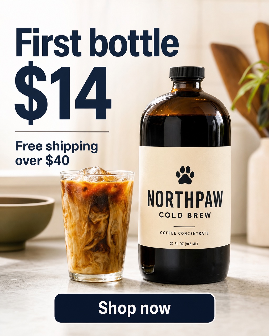
- Hook pattern: the price is the headline. "$14" is the largest element on the canvas.
- Offer pattern: intro price plus a free-shipping threshold, which also nudges basket size.
- Best for: warm audiences and launch weeks.
- What the model got right: every word is spelled correctly, the type hierarchy is clean, and the product is the second thing you see.
- Defects: the "Shop now" bar sits on the bottom edge of the frame. Meta's guidance for 4:5 Instagram Feed ads is to keep the bottom and side edges free of key elements, so this layout would need moving up. The on-image button also duplicates the platform's own CTA button.
Concept 2: Testimonial / review
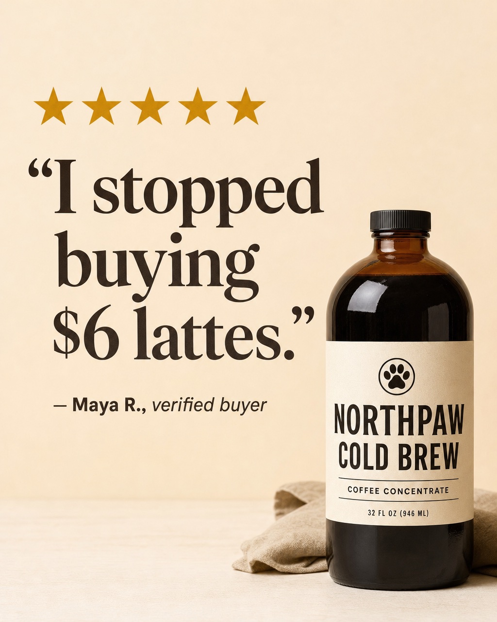
- Hook pattern: a short first-person quote that names the alternative the buyer is paying for now.
- Offer pattern: implicit savings, carried by social proof rather than a discount.
- Best for: comparison-stage buyers and retargeting.
- What the model got right: the serif quote reads as editorial rather than salesy, and the bottle doesn't compete with the words.
- Defects: the review and the reviewer are invented. That's fine for a fictional demo and not acceptable in a real ad: swap in a real, attributable review. The label also changed design here (the paw now sits in a circle above the name), which leads to the biggest problem in this set.
Concept 3: Us vs them
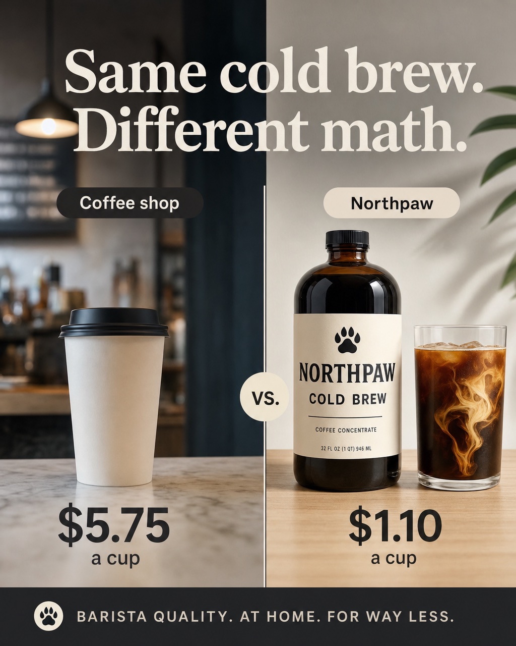
- Hook pattern: a split frame where the price gap is visible before you read a word.
- Offer pattern: cost per cup, the comparison the buyer is doing in their head anyway.
- Best for: buyers who already have a coffee habit.
- What the model got right: the split composition, the labels and both prices rendered exactly as prompted.
- Defects: the model added a tagline we never asked for ("Barista quality. At home. For way less."), which is a quality claim nobody approved. The "coffee shop" side shows a lidded hot-drink paper cup in an ad about cold brew. A real per-cup comparison would also need a sourced price for the competitor side.
Concept 4: Feature callout
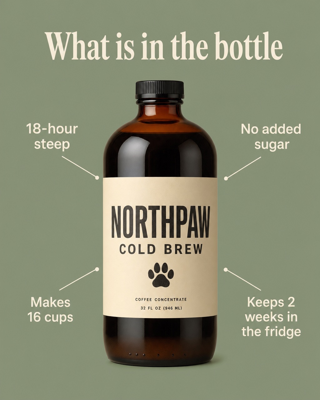
- Hook pattern: a question-style headline ("What is in the bottle") and a clean product hero.
- Offer pattern: clarity. No discount; the four facts are the reason to click.
- Best for: cold audiences who need to understand the product before they care about the price.
- What the model got right: all four labels are legible and correctly spelled, and the layout is the cleanest of the six.
- Defects: the callout lines point at the edges of the label rather than at anything they describe, so they're decorative. Fine for this pattern, but it shows the model doesn't understand what a callout points to.
Concept 5: UGC-style screenshot
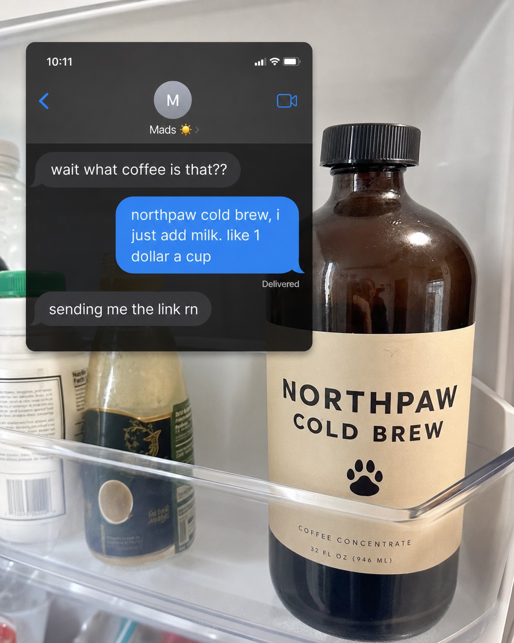
- Hook pattern: it doesn't look like an ad. A message thread reads like a friend's recommendation.
- Offer pattern: price per cup, delivered casually ("like 1 dollar a cup").
- Best for: cold audiences who skip anything polished.
- What the model got right: the lo-fi feel. The message bubbles, the lowercase typing and the fridge-door photo are convincing.
- Defects: the other bottles in the fridge carry garbled pseudo-text on their labels, the classic AI tell when you zoom in. The label typeface changed again (wider letter spacing, paw below the name). The interface closely imitates a real phone messaging app, so check your platform's policies on interface-like creative before running anything similar.
Concept 6: Problem callout
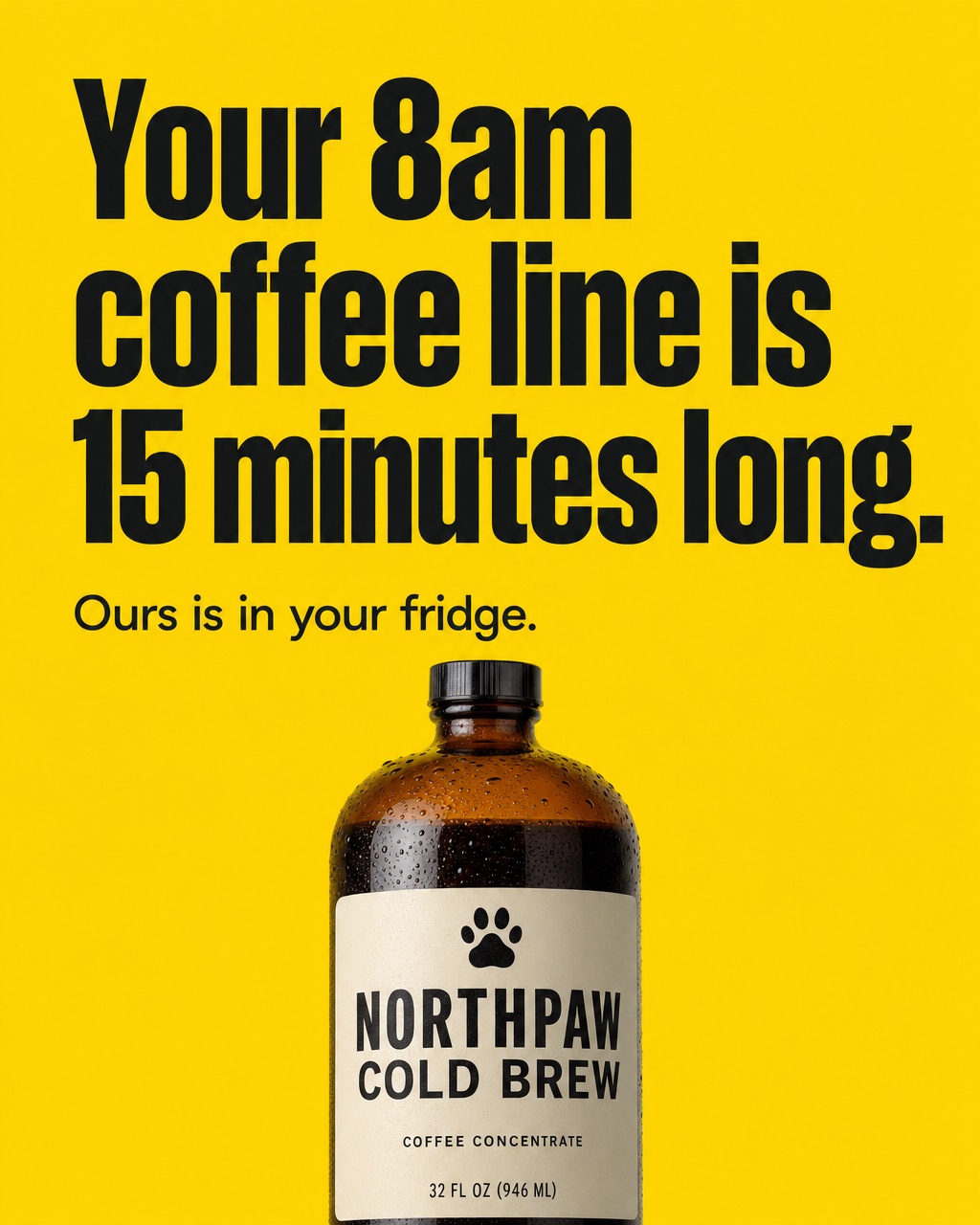
- Hook pattern: names a frustration in the viewer's own words, in the biggest type in the set.
- Offer pattern: convenience. The fix ("Ours is in your fridge") is the offer.
- Best for: cold audiences on commuter-heavy targeting.
- What the model got right: the strongest scroll-stopper of the six. High contrast, one idea, readable at thumbnail size.
- Defects: the bottle and its label run off the bottom edge, the area Meta says to keep clear in 4:5 Feed. "15 minutes" is a specific claim that would need support or softening.
What the set taught us
- Text rendering is solved enough to draft with. All six headlines and every price, label and attribution came out spelled exactly as prompted. On-image copy is now usable for concept drafts, though you still proofread every output.
- Product consistency isn't solved from text alone. The bottle shape held, but the label design shifted in at least three ways across six images: paw above the name, paw in a circle, paw below the name with different letter spacing. In a real campaign, six slightly different labels look like six different products. The fix is a reference image of the real packshot, not a better prompt.
- Models add things. One unrequested tagline is a small problem in a demo and a compliance problem in a live ad. Read every word on every output.
- The model doesn't know the safe zones. Two of six concepts put key elements on the bottom edge. Check placements before upload.
- The concept spread is the useful part. The value isn't any single image. It's getting six genuinely different angles in front of a reviewer in minutes, so the human time goes into choosing and fixing rather than drafting.
How to test static ads: the three-rung ladder
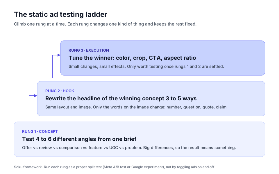
The most common static-ad testing mistake is testing small things first: two background colors, two button labels. Those tests take a long time to reach a readable result and teach you little. Test big differences first and work down.
Rung 1: Concept
Run four to six concepts that differ in type, like the six above: offer, review, comparison, feature, UGC, problem. Keep the audience, budget and placement the same. You're asking "which angle does this audience respond to?", and big differences produce readable answers.
Rung 2: Hook
Take the winning concept and rewrite only the on-image headline three to five ways: a number, a question, a quote, a bold claim. Keep the image and layout fixed. This is where you find out whether the angle won or the specific words did.
Rung 3: Execution
Only now test color, crop, CTA wording and aspect ratio. These are real effects, but small ones, and they're only worth the budget once the concept and hook are settled.
Run it as a real test
Meta's own help center says not to test "informally, such as by turning ad sets or campaigns on and off manually," because it "can lead to inefficient ad delivery and unreliable test results." Its A/B testing tool splits the audience so "nobody sees both" versions (Meta Business Help: About A/B testing). On Google, custom experiments split a campaign's traffic and budget, but Google lists them as available for Search, Display, Video and Hotel campaigns, not App or Shopping (Google Ads Help: custom experiments). In Performance Max and Demand Gen, your static images compete inside the asset group, so a "test" there is closer to supplying distinct options than to running a clean split.
Two habits keep the results honest:
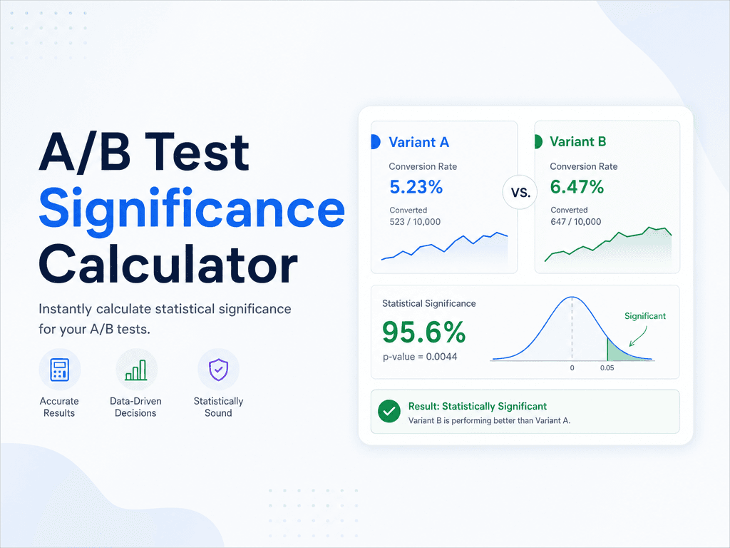
- Decide the metric and the stopping point before launch. Checking daily and stopping when one variant pulls ahead is how identical ads produce "winners". Our ad creative testing framework covers why peeking breaks tests, and the A/B test significance calculator tells you whether a gap is real.
- Plan the refresh. A winning static wears out like any other creative. When frequency climbs and click-through falls, go back to rung 1 with new concepts rather than recoloring the old winner. Our guide to fixing ad fatigue covers the signals.
Making static ads with AI: a workflow that holds up
Based on the test above, this is the workflow we'd use for a real brand:
- Write one brief with the facts fixed. Product, audience, the one offer you can actually honor, and the claims you can substantiate. Every concept draws from the same facts, so nothing invented sneaks in.
- Generate one concept per type, not ten versions of one type. Distinct angles are what rung 1 needs and what Meta's delivery system rewards.
- Pass the real packshot as a reference image. This is the fix for the label drift in our test. Text-only prompting is fine for layout exploration and unreliable for product fidelity.
- Review every output against a checklist: spelling, every claim true, no unrequested copy, no garbled background text, key elements inside the safe zone.
- Resize deliberately. Make the 4:5, 1:1, 9:16 and 1.91:1 versions, and check that the headline still reads in each crop.
- Launch as a test, paused, and approve it. Then climb the ladder.
If you want to see how image models compare on ad-specific jobs like typography and product fidelity, we ran that test in GPT Image 2 vs Nano Banana 2 for ad creative.
Where Soku fits
Soku is an AI agent that runs ad accounts, and static creative is part of that loop. Here's what it does today, and nothing more:
- Generates ad images from a brief. Soku's image tool runs on GPT Image 2.5 through fal. It doesn't draw brand logos itself; those are composited in later, and when you supply reference images it switches to the edit model so your real product steers the output.
- Builds the ads in your Meta account, paused. Soku can upload images to a connected Meta ad account and create image ad creatives from them. New Meta ads are created paused, and writes go through an approval step, so nothing spends until you approve it.
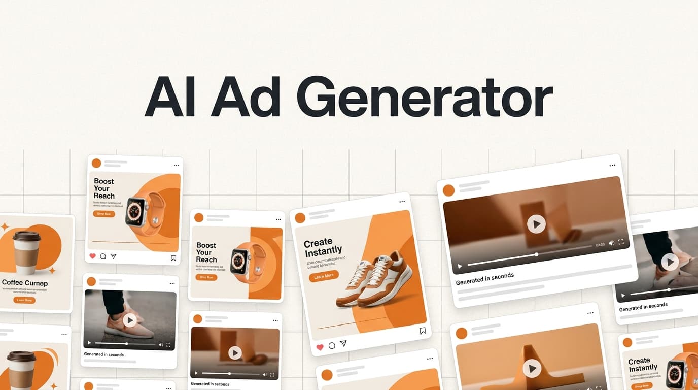
- Free browser tools for the checks above. The ad safe zone checker and ad mockup generator run in your browser. For one-off images there's the AI banner generator, and when a static concept wins and you want a short video version, the AI ad generator turns an ad-shaped prompt into a clip.
Note that the six concepts on this page were generated directly with gpt-image-2 through fal's API, not through Soku, which now uses the newer GPT Image 2.5.
Where to go next
- Real-brand examples by mechanism: 40 advertisement examples that actually converted
- Every Meta size and safe zone: Facebook and Instagram ad sizes and safe zones
- Organic Instagram crops: Instagram post size guide
- Google Display banners and the 150KB limit: display ad examples
- Video variants at volume: create 100+ AI ad variants
- Testing without fooling yourself: ad creative testing framework